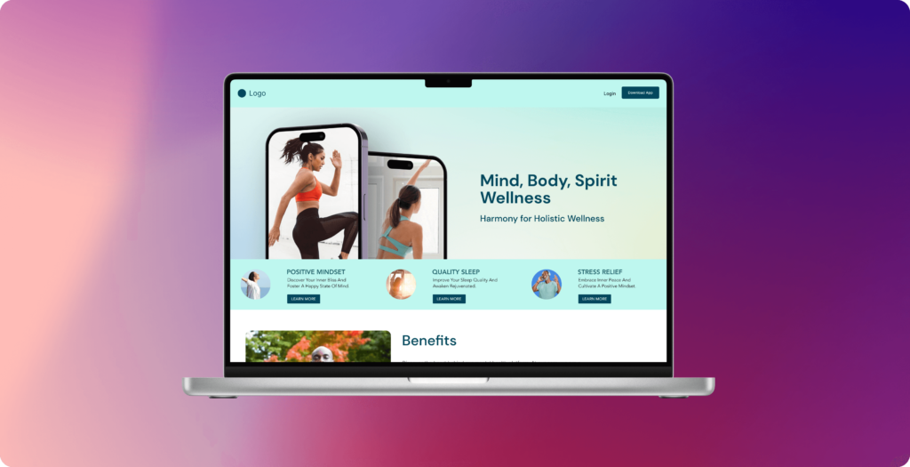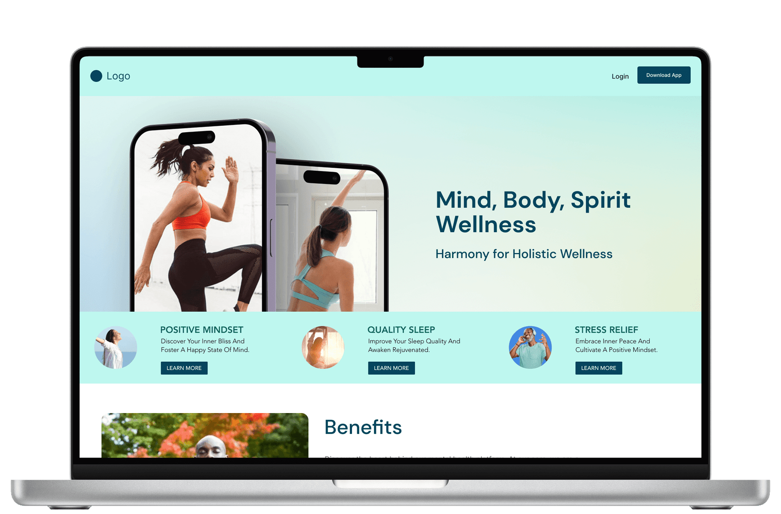
Results
Increased
Visual Hierarchy
Visual Hierarchy
Reduced
Navigation Complexity
Navigation Complexity
Introduced
a Clear Call-To-Action
a Clear Call-To-Action
Category
Website & App Design
Responsible for
As a UI/UX designer, I played a pivotal role in the design process of WellMind's app and single-page website. My responsibilities included creating wireframes, prototypes, and mockups for both platforms, ensuring a seamless user experience.
Industry
Wellness | B2C
Tools Used


WellMind App - A Holistic Wellness Platform
For privacy/confidentiality purposes, the name has been changed to a fictional one.
Introduction
The WellMind App and website were created to offer support for people struggling with stress, anxiety, sleep issues, and overall wellness.
In the wake of the global COVID-19 pandemic, the need for accessible wellness solutions became abundantly clear. People were struggling more than ever with stress, anxiety, sleep issues, and a general sense of being overwhelmed.
As the UI/UX designer for this exciting project, my mission was to create an experience that felt welcoming and approachable for anyone seeking support, regardless of their specific wellness challenges.
- Mobile App Design
- Web Design
Challenges and Solutions
This initial design phase presented a unique challenge – since it was the first iteration of both the app and website, there was no existing user base to guide the design. However, extensive research on post-pandemic wellness trends provided valuable insights. By understanding the common anxieties and goals of our target audience, I could begin crafting a design that addressed those needs.
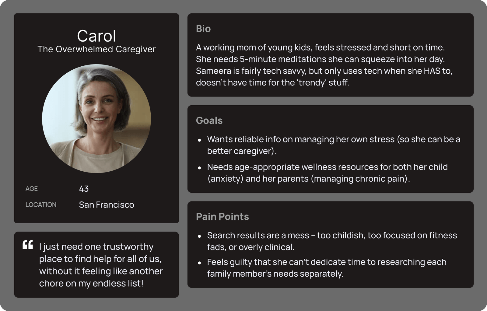
This user-centered approach informed every design decision. Below are some of the initial hurdles and how I tackled them:
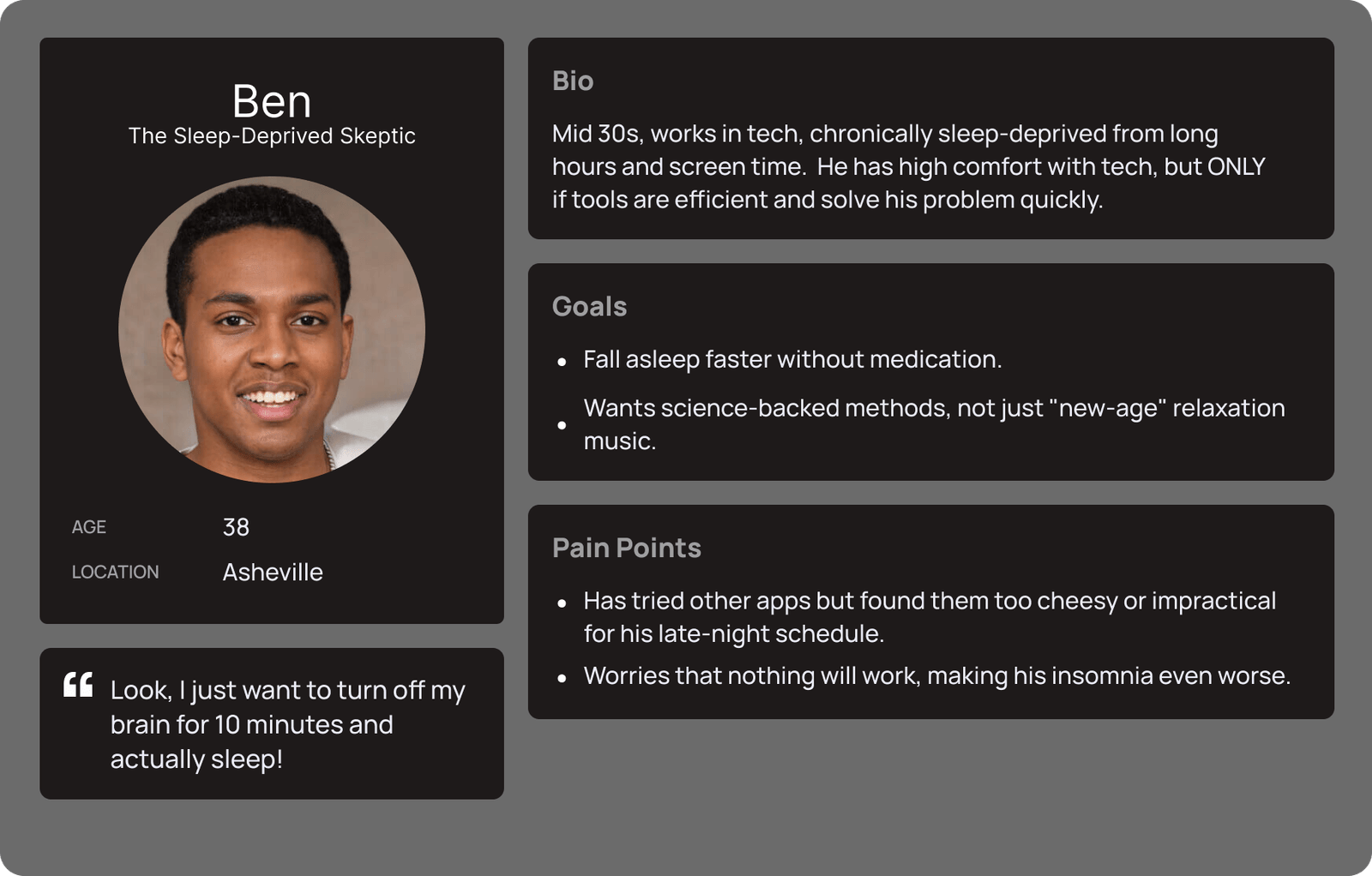
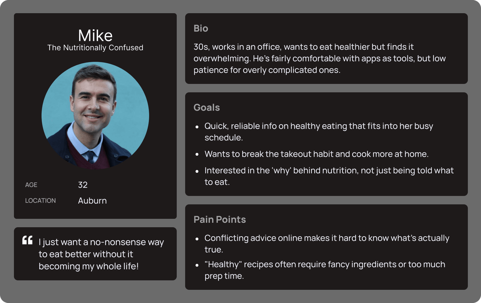
Audience Personas

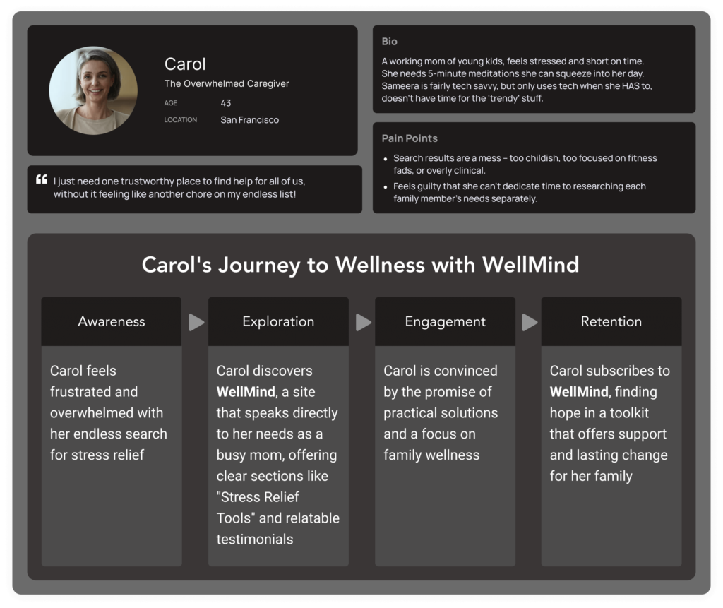
User Journey Map
The user journey map outlines the steps users take from discovering WellMind to achieving their wellness goals. It includes stages such as Awareness, Exploration, Engagement, and Retention, highlighting touchpoints and interactions along the way.
Navigating the Wellness Landscape: A Tale of Competitors and Differentiators
In the competitive world of wellness apps, Tranquil and Serenity stand out. Both aim to guide users towards mindfulness.
Tranquil excels with a vast library of guided meditations, offering diverse options for relaxation and stress relief. Serenity, on the other hand, prioritizes community.
Group meditations and forums create a sense of shared experience and support.
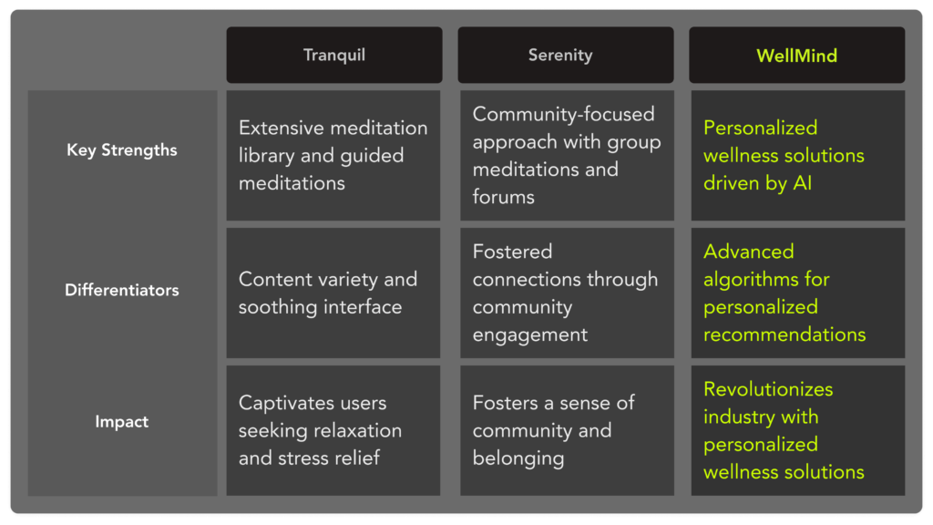
A game-changer in the market! It analyzes user data to offer uniquely personalized meditations and insights. This sets it apart from competitors like Tranquil, known for its vast content library, and Serenity, which emphasizes community. Our app delivers a truly tailored experience, driven by cutting-edge AI.

Learning and Reflection
- Simple design is powerful. Small changes can significantly reduce frustration for users.
- User testing is essential, even if results are mixed – it pinpoints areas most in need of improvement.
- Designing for a diverse audience means considering different skill levels and prioritizing clarity.
Why Simplified Language
This case study uses clear language to make design concepts understandable for a wide audience. It demonstrates the real-world impact of design choices, encouraging collaboration and making the field less intimidating.


